One More Bite
Visual Identity
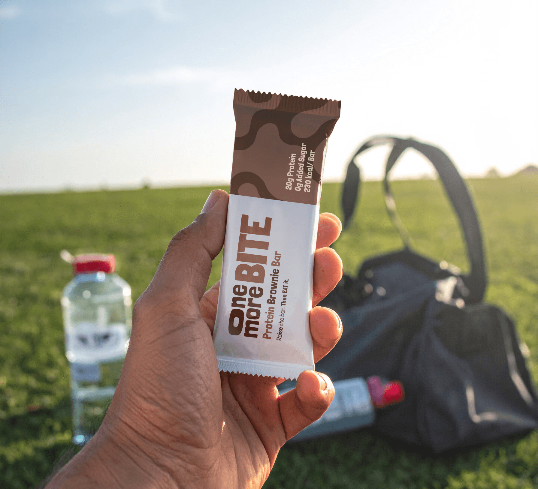
Sprint design challenge · Protein Bar THE BRIEF I SET MYSELF Protein bar packaging is flooded with clinical, supplement-aisle visuals. I set myself a fast brief: design an identity that triggers a craving on sight and reads as a luxury retail item, not a supplement — without leaning on a single piece of standard sports-nutrition language. THE EXECUTION A bold, decadent typographic treatment and a rich, elegant palette do the work of making the product desirable before a single ingredient is read. Premium textures and clean type let the ingredient profile speak for itself instead of shouting "healthy" at the shelf. WHY IT'S HERE This one's in the portfolio to show range and speed — a full identity concept built and executed in a short, self-imposed sprint, not a multi-week client engagement.

Tell me about your next project.
Share a few details and I’ll get back with next steps, availability, and a direction we can build from.